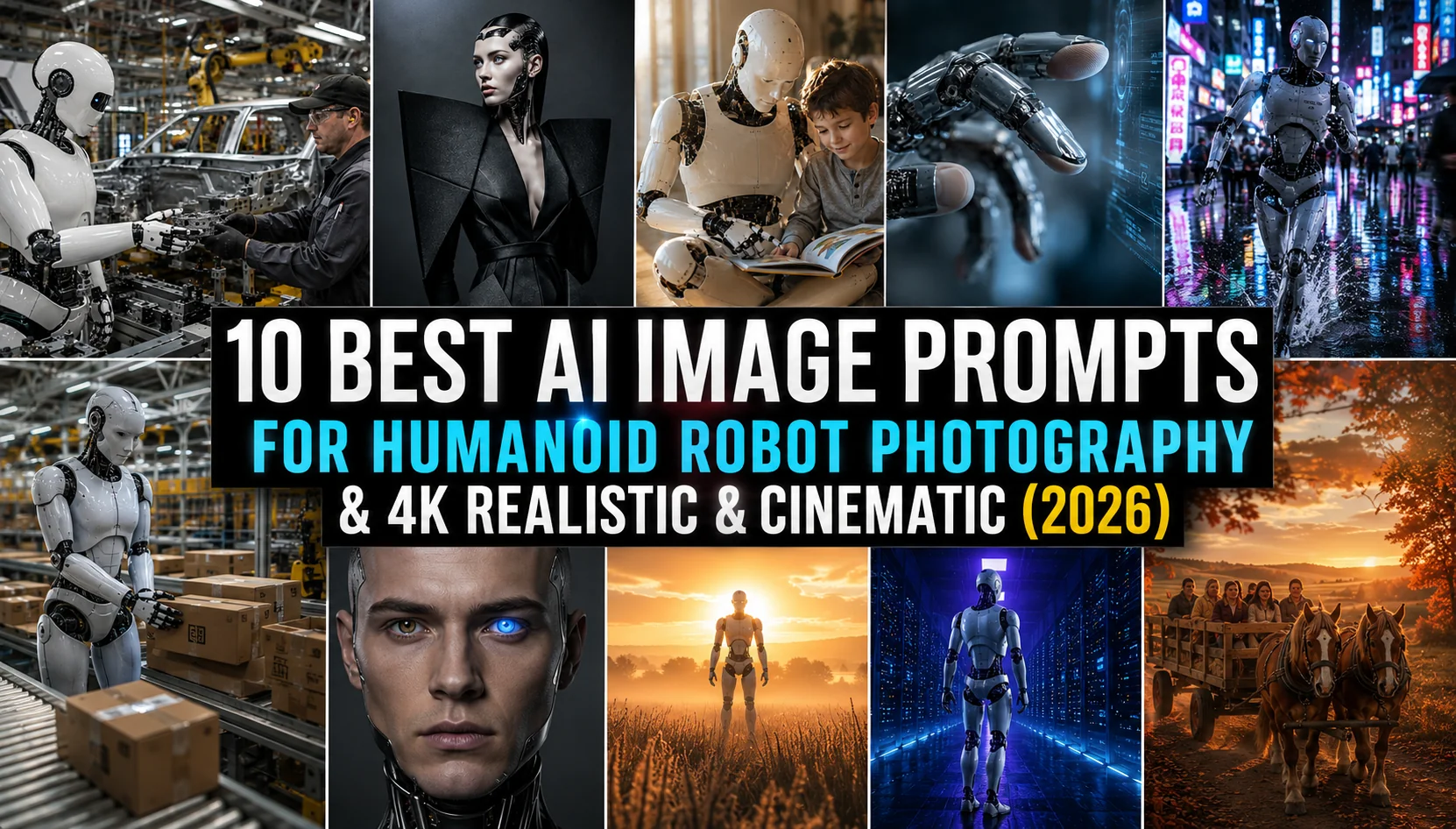
Why Your AI Images Look Bad: 10 Common Prompt Mistakes and How to Fix Them (2026)
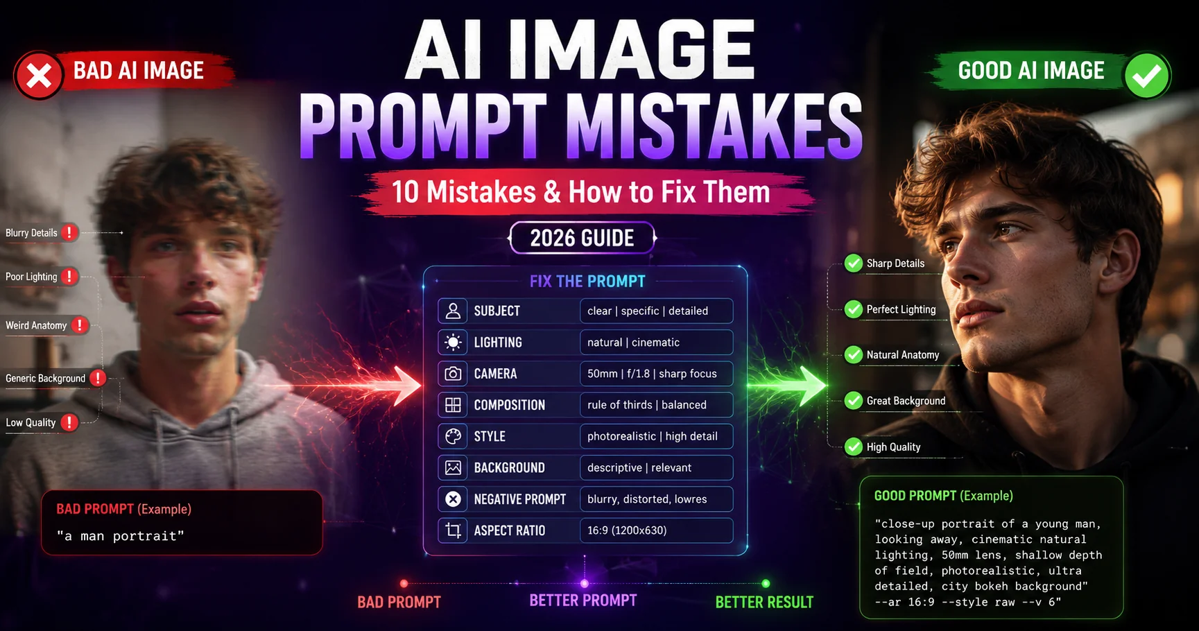
You've typed a prompt into ChatGPT, Gemini AI, or Midjourney — and what came back looks nothing like what you imagined. The lighting is flat, the faces are oddly proportioned, the background is a visual mess, or it's just painfully generic. You're not alone. The quality of your AI-generated images is strongly influenced by the quality and structure of your prompt — and most people are making the same 10 mistakes without realizing it. In this guide, we break down each mistake in plain language, show you a bad example vs. a fixed example side-by-side, and give you a clear, actionable fix. Whether you use ChatGPT (DALL-E 3), Google Gemini AI, Midjourney v6, Stable Diffusion XL, or Adobe Firefly, these fixes will immediately and noticeably improve your results.
- 10 specific, fixable mistakes — explained clearly with examples
- Works for ChatGPT, Gemini AI, Midjourney, DALL-E 3, Firefly & SDXL
- Bad vs. Good prompt comparisons for every mistake
- Covers lighting, composition, style, aspect ratio, negative prompts & more
- Beginner-friendly — no technical background needed
The 10 Mistakes at a Glance
- Your prompt is too vague and short
- No lighting specification
- Missing camera and lens details
- Conflicting style instructions
- No composition or framing direction
- Ignoring the background
- Too many subjects in one prompt
- Not using negative prompts
- Wrong aspect ratio for the subject
- Copy-pasting generic prompts without customization
1 Your Prompt is Too Vague and Short
This is the single most common reason AI images look disappointing. When you give an AI a prompt like "a beautiful woman" or "a cool photo", you're leaving almost every creative decision entirely to the model — and AI tools, when given no direction, default to the most statistically average interpretation of your words. That means generic face, neutral expression, flat lighting, plain background, and a result that looks identical to a thousand other outputs. The AI is not lazy — it simply has nothing to work with. Think of it like briefing a world-class photographer: the more specific your brief, the better the result.
2 No Lighting Specification
Lighting is the single most powerful element in photography — and AI image generation is no different. Without a lighting description, the AI defaults to flat, even, directionless illumination that makes images look lifeless, studio-catalogue dull, or like a smartphone snapshot taken indoors. Professional photographers spend more time thinking about light than almost any other aspect of a shot. The AI can replicate any lighting condition in the world — from the golden warmth of a Rajasthan sunset to the cold blue of a studio strobe — but only if you tell it what you want. Leaving lighting undefined is like asking a chef to cook "something" — technically they will, but it probably won't be what you had in mind.
3 Missing Camera and Lens Details
Here's a secret that separates beginners from advanced AI image creators: adding camera and lens information to your prompt is one of the most effective ways to make AI outputs look like actual professional photography rather than digital illustrations. When you specify a camera model, lens focal length, and aperture, the AI's training data associates those parameters with the specific look that real photographers produce using that equipment — the compression of a telephoto lens, the creamy bokeh of an f/1.4 aperture, the wide perspective distortion of a 16mm, or the clinical sharpness of a medium-format sensor. Without this, the AI produces a generic "image" rather than a "photograph".
4 Conflicting Style Instructions
Stacking multiple contradictory aesthetic styles in a single prompt is a very common beginner mistake that produces confusing, inconsistent, or visually muddled results. Prompts like "ultra-realistic anime watercolor oil painting cyberpunk photographic cartoon" give the AI conflicting instructions it cannot reconcile — it cannot simultaneously be hyper-realistic and a cartoon, cannot be a photograph and a watercolor painting at the same time. The result is often an uncanny hybrid that looks like none of those styles particularly well. Each aesthetic style in AI image generation has its own training data signature — mixing them creates visual noise, not creativity.
5 No Composition or Framing Direction
When you don't specify how you want the image framed, the AI makes a random compositional choice — and it frequently gets it wrong for your intended use. For a profile picture, you might get a full-body shot. For a dramatic landscape, you might get a tight close-up. For a magazine cover concept, you might get a horizontal image. Composition is the grammar of visual language — it determines what the image is about, where the viewer's eye travels, and whether the final image is usable for your specific purpose. Professional photographers never frame a shot randomly — they make intentional decisions about every element of composition before pressing the shutter.
6 Ignoring the Background
The background of an AI image is often where the quality falls apart most visibly. When you don't describe it, the AI fills it with whatever was statistically most common in training images — often a blurry nothing, a generic interior, an awkward outdoor environment, or worse, a background that completely contradicts the subject's context. A corporate executive portrait shouldn't have a forest background. A wedding shoot shouldn't have a parking lot behind it. Even in cases where you want a simple background, specifying "clean white studio background with soft shadows" or "blurred dark bokeh background" produces dramatically better results than leaving it undefined. The background occupies a significant portion of the visual real estate in most images and can strongly affect the overall composition.
7 Too Many Subjects in One Prompt
More subjects does not mean a better image — in fact, the opposite is almost always true. AI image generators allocate their attention (literally — via attention mechanisms in their architecture) across all the subjects you specify. The more elements competing for attention, the less detail and coherence each one receives. A prompt with ten subjects produces an image where none of them look right. The AI is also forced to make spatial relationship decisions it wasn't guided on — where does each subject stand relative to the others? What size are they? Who is the focal point? Without answers to these questions, the result is visual chaos that no amount of regenerating will completely fix.
8 Not Using Negative Prompts
Negative prompts are one of the most powerful and most underused tools in AI image generation. They tell the AI what to explicitly not include in the output — and they work remarkably well. Without them, AI generators frequently produce: extra fingers or deformed hands, blurry or smeared facial features, watermarks or text overlays, overexposed or underexposed areas, JPEG-like compression artifacts, unrealistic skin textures, and distracting background clutter. Many experienced AI image creators use negative prompts or exclusion instructions as part of their workflow. It's the equivalent of a photographer telling their team before a shoot: "no shadows on the face, no cluttered props, no reflections in the lens".
--no [terms] at the end. In Stable Diffusion — use the "Negative Prompt" field. In ChatGPT/Gemini — add: "avoid blur, watermarks, extra limbs, distorted faces, text overlays, and poor lighting" within your prompt. Keep a standard negative prompt list you paste into every generation.9 Wrong Aspect Ratio for the Subject
Aspect ratio is one of the most overlooked but immediately impactful settings in AI image generation. Using the wrong aspect ratio for your intended subject type creates images that are either awkwardly cropped, compositionally imbalanced, or simply unusable for their intended purpose. A portrait generated in 16:9 landscape mode will have the subject's head awkwardly small or cropped. A landscape scene generated in 1:1 square loses the sweeping horizontal breadth that makes landscape photography powerful. A social media profile picture generated in 16:9 will look wrong in a round avatar frame. Getting aspect ratio right costs zero extra effort — and gets it wrong when ignored.
--ar W:H. In ChatGPT/Gemini, state the ratio in the prompt.10 Copy-Pasting Generic Prompts Without Customization
The internet is full of "100 best AI prompts" lists — and millions of people copy and paste them without modification. The result is that everyone gets the same-looking image. If you copy a generic Midjourney portrait prompt and generate it, you'll get an output that looks almost identical to what thousands of other users have already generated with that same prompt. AI image generators produce statistically similar outputs for similar inputs — that's literally how they work. The only way to get unique, distinctive AI images that reflect your own creative vision is to invest the small but crucial effort of personalizing and layering your prompts with details that are specific to your context, subject, and intent.
The Right Structure for Every AI Image Prompt
Now that you know what not to do, here is the universal prompt structure that works across all major AI image generators — ChatGPT (DALL-E 3), Google Gemini AI, Midjourney v6, Stable Diffusion XL, and Adobe Firefly. Follow this order every time and your results will improve dramatically:
Step 1 — Quality Anchor (always first)
Start every prompt with a quality signal. Use: "4K ultra-realistic photography," "ultra-detailed hyperrealism," or "cinematic 8K quality." This anchors the AI toward high-fidelity output from the start.
Step 2 — Subject with Specifics
Describe who or what is in the image: age, gender, ethnicity, distinguishing features, emotional expression. Be specific. "A confident Indian woman in her early 30s with deep-set dark eyes and a composed expression" is infinitely better than "a woman."
Step 3 — Attire and Appearance
Describe clothing with fabric type, color, and any notable design features. For photoshoot-style images, this is where you describe the style: "wearing a moss green linen blazer over a white cotton shirt, sleeves rolled up, no tie."
Step 4 — Location and Setting
Describe where the image is set with enough detail to disambiguate. Not just "a forest" but "an ancient cedar forest in the Western Ghats with dense canopy and fern-covered forest floor."
Step 5 — Lighting
Always specify the light source, quality, and direction. Examples: "warm golden hour backlight casting long shadows," "cool blue hour ambient light," "dramatic studio key light from camera left with soft fill," "diffused overcast natural light."
Step 6 — Camera, Lens, and Technical
Add camera reference, lens focal length, and aperture: "shot on Sony A7R V, 85mm f/1.4 G Master lens, shallow depth of field." This is what makes outputs look like real photographs.
Step 7 — Style Reference
Close with a photographic or artistic style reference: "National Geographic editorial photography," "Vogue India fashion spread," "Annie Leibovitz portrait style," "architectural photography for Dezeen magazine."
Step 8 — Aspect Ratio
End with the correct aspect ratio for your output: --ar 3:4 for portraits, --ar 16:9 for landscapes and desktop wallpapers, --ar 1:1 for social media square, --ar 9:16 for vertical Stories or Reels.
Jitendra Patra
AI Prompt Researcher & Software Engineering Student
Jitendra Patra is a software engineering student and AI prompt researcher who has spent significant time analyzing why AI-generated images succeed or fail. Through iterative prompt research across multiple AI image generation tools, he has identified common prompt mistakes and developed practical frameworks for producing better AI images.
His findings are grounded in hands-on experimentation — covering prompt structure, lighting descriptors, compositional language, and subject specificity. The mistakes and fixes documented in this guide reflect that research.
This guide is designed as a practical, honest resource for anyone who wants to understand why their AI images look generic — and what to try differently.
Frequently Asked Questions
Why do my AI-generated images always look bad?
AI images look bad primarily because of poorly structured prompts. The most common reasons include: prompts that are too short and vague, no lighting specification, missing camera details, conflicting style instructions, undefined backgrounds, too many subjects, and not using negative prompts. Fixing these 10 specific mistakes — as detailed in this guide — dramatically and immediately improves AI image quality, regardless of which AI tool you use.
How do I make my AI images look more realistic and professional?
To make AI images look more realistic: (1) specify a camera and lens — "Canon 5D Mark IV, 85mm portrait lens, f/1.8", (2) add detailed lighting — "golden hour backlight" or "studio three-point lighting", (3) start with "4K ultra-realistic photography", (4) describe the environment precisely, (5) use one coherent aesthetic style, not multiple conflicting ones, and (6) use negative prompts to exclude blur, artifacts, and distortions.
What are negative prompts and how do I use them?
Negative prompts tell the AI what not to include. In Midjourney, add --no [terms] at the end of your prompt. In Stable Diffusion, use the dedicated "Negative Prompt" field. In ChatGPT or Gemini, simply add a sentence like: "Avoid blur, extra fingers, watermarks, distorted anatomy, text overlays, and poor lighting." Good default negative prompt terms: blur, extra fingers, deformed hands, watermark, text, low quality, pixelated, overexposed, underexposed, unrealistic anatomy.
What is the best prompt structure for AI image generation?
The most effective AI prompt structure is: Quality Anchor → Subject → Appearance → Location → Lighting → Camera/Lens → Style Reference → Aspect Ratio. For example: "4K ultra-realistic photography of [subject description], wearing [attire], at [location], [lighting description], shot on [camera], [style reference], --ar 16:9." Following this structure consistently produces far better results than unstructured descriptions.
Why does the AI keep generating extra fingers or deformed hands?
AI models historically struggle with hands because human hands appear in millions of different positions and the model must generate each finger individually. To minimize this: (1) add "--no extra fingers, deformed hands, distorted anatomy" to negative prompts, (2) use newer AI models — Midjourney v6, DALL-E 3, and Gemini Imagen 3 handle hands significantly better than earlier versions, (3) compose your image so hands are not the focal point, (4) position hands partially behind other objects or out of frame, and (5) try inpainting tools to fix specific hand areas in the output.